How to Use Graphics Effectively in Your Stall Design

How to Use Graphics Effectively in Your Stall Design

How to Use Graphics Effectively in Your Stall Design

In the fast-paced world of exhibitions and trade shows, the visual appeal of your modular stall can be the difference between blending into the background and standing out. When used effectively, graphics can be a dynamic tool for telling your brand’s narrative, grabbing attention, and making an impression. Think of your stall as a canvas and your graphics as the brushstrokes that turn it into a work of art, grabbing attention and telling a story that lingers in the mind.

Let’s explore the techniques of how to use exhibition graphics effectively in your stall design to produce a striking visual masterpiece that appeals to your audience.

Define Your Story

Your exhibition stall in India is not just a physical space; it’s a canvas for your brand story. Describe your story before beginning graphic design. What is the main point you wish to make? Who are you trying to reach? Knowing these things can help you make better graphic decisions and make sure that each visual aid supports the main narrative you’re trying to convey.

Preserving your Brand

Effective branding is built on persistence. The colors, typefaces, and artwork in your exhibition graphics should all be in perfect harmony with your brand identity. This visual uniformity, which extends to all materials like banners and posters as well as digital displays, promotes brand identification and creates a polished and consistent visual identity.

Strategic Placement

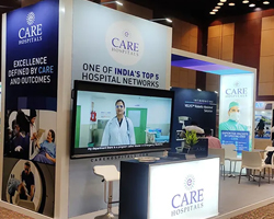
Take into account how many people are walking through the display space. Strategically place important pictures to draw attention at different times. Key product or service images should be positioned strategically for optimal exposure, and the entryway should have an engaging image to entice people. Placement at eye level will have the greatest impact. Do consider briefing the exhibition stall designer about the details.

Scale and Size

Your image’s dimensions have to match the size of your stall. In the packed exhibition hall, large, powerful pictures may be seen from a distance and operate as beacons. Balance is important. A large graphic in a cramped space might overwhelm rather than dazzle. To produce a cohesive visual impression in the upcoming exhibitions in India, take the size of your graphics into account.

Clarity is Paramount

Clarity prevails over-complication in the field of exhibition stall design. For exhibition stalls in India, your graphics should communicate your message. Refrain from having too much stuff around. Every graphic should have a specific function, whether it is emphasizing a promotion, presenting a product, or conveying a critical brand message. Accept simplicity for lasting influence.

Quality Counts

The credibility of your brand might be damaged by visuals that are blurry or distorted. Invest in high-quality images at a time when high-resolution displays are the standard. Sharp and clear images, whether they are product illustrations, logos, or background pictures, help to create a polished and professional stall design.

Engaging Interactive Graphics

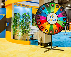
To increase visitor engagement, include interactive features in your stall visuals. Static visuals may be transformed into dynamic experiences using touchscreen displays, augmented reality, or QR codes that are linked to multimedia material. Interactive visuals draw attention and inspire more in-depth engagement with your brand.

Drawing Out Important Points

Make your graphics’ central theme your key messages, which you should have identified. Use clever visual arrangement and design in your exhibition graphics to highlight key messages, whether it’s a new product launch, a special campaign, or a brand milestone. Incorporate images into your brand narrative to lead visitors through it.

Bringing Products to Life

Your goods or services may be given life by the exhibition stall design company. Showcase the qualities and advantages of your offerings with high-quality images. Visitors may better understand the value your goods or services provide to their lives by using infographics, lifestyle photos, or before-and-after visuals.

Amplification After the Event

The effects of your stall visuals go beyond the actual occurrence. Utilize the event’s images for marketing and advertising purposes. To increase the exposure of your stall design and strengthen the message of your business, share high-quality photos and videos on your website, newsletters, and social media channels.

Make a Sustainable Choice

Exhibition stall graphics instead of vinyl, when printed on reusable fabrics not only make your presentation vivid but also make it sustainable. Fabric graphics offer a unique advantage over vinyl because they can be washed and reused for multiple events. This not only extends the life of your display materials but also contributes to a more sustainable approach to exhibition planning. By choosing washable fabric graphics, you make your stall not only visually appealing but also eco-friendly.

Conclusion

Using graphics effectively in stall design requires creativity, branding, and tactical communication. When done well, exhibition graphics can turn your display into an attention-grabbing work of art that leaves a lasting effect on the audience. In the competitive world of exhibits, make your stall design a showstopper by embracing the power of graphics. Consult Expo Exhibition Stands India now!

As the leading exhibition stall design company, we create high-quality, long-lasting stalls that effectively display your items. We offer complete services and convenience to modify graphics tailored to your unique needs, whether you require a temporary or custom stall. Count on us for a hassle-free, high-quality experience with transparent pricing and lifetime free design layout services.

Ready to transform your stall design with the power of graphics? Contact us at +91-9167 246768 or email at enquiry@expoexhibitionstands.co.in.