The Psychology of Colour in Exhibition Stall Design
Be it objects, places, or thoughts, colours significantly set the overall mood, meaning, and experience. When it comes to business and marketing, organizations use colours as a psychological attempt to make their sales margins go up. Just like how a retail store might use specific colours to encourage shoppers to make a purchase, exhibition stall designers use colour to influence how visitors perceive their brand. When you walk into an exhibition hall, you’re surrounded by a sea of stalls, all vying for your attention. You’ve only got a limited amount of time and energy to spare. What’s going to make you stop and pay attention to one stall over another? Often, it’s the visual appeal. And colour is a major part of that.
In this blog, we’re diving deep into the topic of how colour affects exhibition stall design. We’ll talk about how different colours evoke certain emotions and how you can use that knowledge to make your stall stand out and connect with visitors on a deeper level. From the bold use of red to invoke excitement, to the calming shades of blue that invite trust, we’ll examine how smart colour choices can make a lasting impression on your audience.
Role of Colours in Exhibition Stall Design
The exhibition stall designs go beyond aesthetics; they can draw in customers, keep them interested, and make a good impression. A human mind, on the other hand, is designed in a way that responds to sensory signals and triggers. Exhibition stall design ideas can be created in a way that evokes desired emotions, thanks to the psychology of colour.
Additionally, a well-designed exhibition stall design not only displays goods or services but also captures the essence and core values of the company. Reaching out to a professional exhibition stall design company might help you make your brand stand and shine.
Understanding the Fundamentals
Understanding the fundamentals of colour theory is crucial before delving into specific hues and their psychological effects. Colours are more than simply decorative components; they can provoke feelings, send messages, and have a behavioural impact.
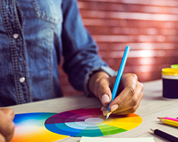
The basis for developing a unified and practical design is the use of the three primary colour groups –
- Warm– reds, yellows, and oranges,
- Cool– blues, greens, and purples, and
- Neutral– browns, greys, and whites.
The Colour Psychology in Exhibition Stall Design
1. Red
Affiliation – Energy, passion, and enthusiasm.
Application: Excellent for drawing attention and evoking a sense of urgency. Red may be deliberately used to inspire activity and foster a lively atmosphere.
2. Yellow
Affiliation – Warmth, positivity, and optimism.
Application: Yellow is an eye-catching colour that works well to foster a welcoming environment. It’s frequently used in exhibition stalls to imply approachability.
3. Blue
Affiliation – Trust, professionalism, and composure.
Application: Blue conveys a sense of dependability and trustworthiness and is frequently selected by I.T. and financial industries. It also works well for establishing a calm atmosphere.
4. Green
Affiliation – Tranquility, health, and growth.
Application: Green is frequently utilised in eco-friendly and wellness-related sectors because it encourages sentiments of harmony and balance.
5. Black
Affiliation –Sophistication, strength, and grace.
Application: Black may offer a touch of refinement and modernity to the design of an exhibition stand despite the fact that it may initially look overbearing.


